True Leaf Market Catalog
Brief: Design an eight page catalog layout for an existing company. Your design must have the following: facing pages and two separate sections (each section must have its own master page with a slightly different style). You must use high resolution images. You must use graphic elements to divide the space and guide the reader’s eye through the layout. In addition, you must use both character and paragraph styles.
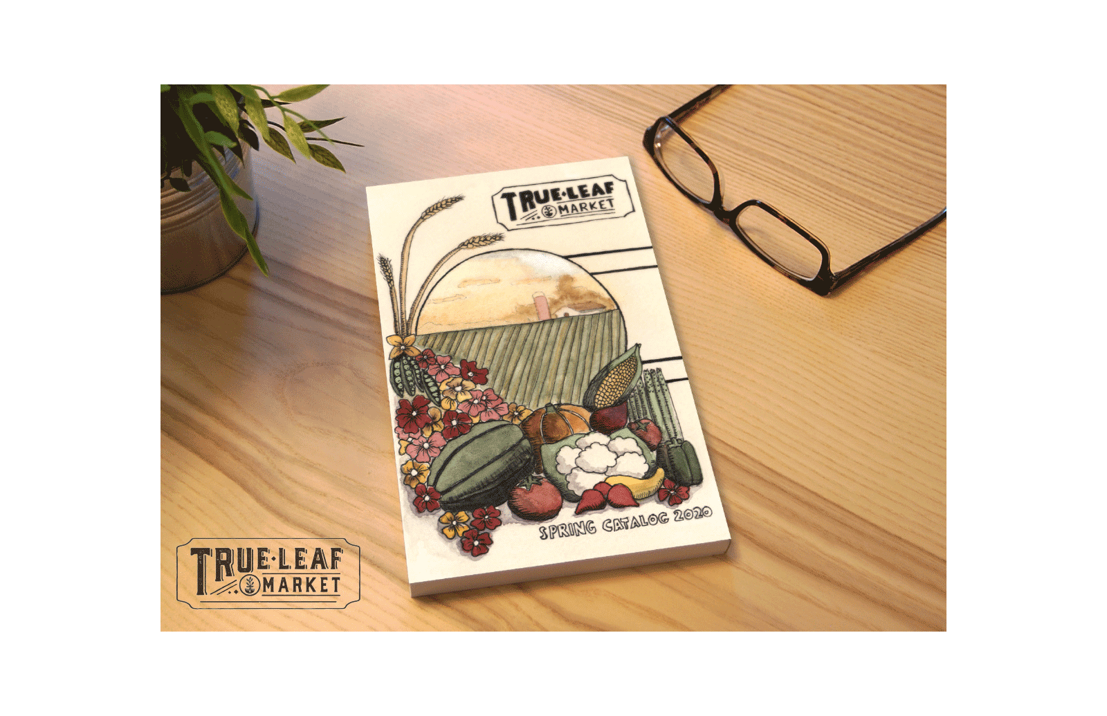
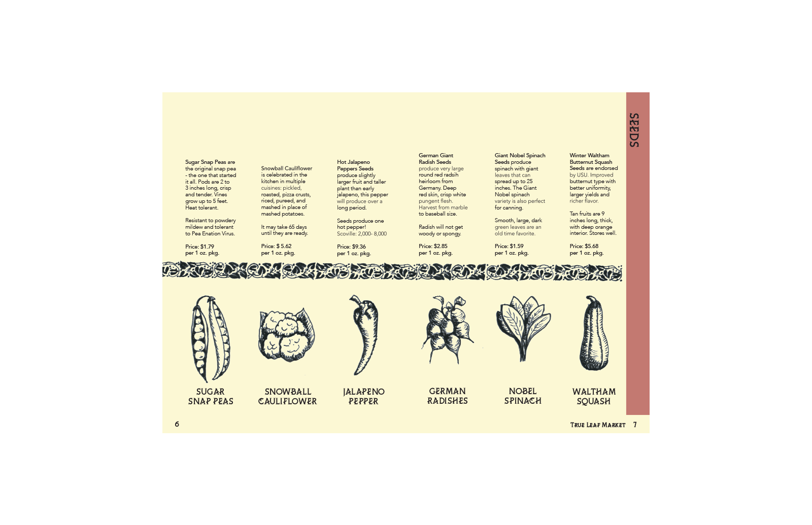
Solution: I based my design on a present day heirloom seed company, True Leaf Market, in Salt Lake City, Utah. Their website tries to convey an antique feeling but falls short. I wanted to really the invoke an antique feeling for my catalog. I used an antique typeface, ChiQuel and Charcuterie ornaments, and frames. I created the illustrations of the vegetables myself using ink to mimic vintage illustrations. After researching vintage seed packets, I was inspired to create my own watercolor illustrations for the front and back cover of the catalog. I used the muted palette after researching vintage catalogs and seed packets from the late 1800s.


